
Sunday, 28 February 2016
Friday, 26 February 2016
Questionaire Post Media Products
For my magazine cover the questions that I asked were:
1) Is the cover easily recognisable as being from the horror genre and How?
2) What conventions of the cover contribute to the horror genre and is it realistic compared to existing magazine covers (e.g. Fangoria) Why?
3) What would make you by the magazine and Why?
4) Does the magazine support the teaser trailer and attract your attention? Why and How?
5) What should be changed to benefit the magazine cover? Why?
The questionnaire for my Poster:
1) Does the cover represent a spooky and eery feel? Why and How does it make you feel?
2) From the poster would you want to see the film? Why?
3) Does the poster relate to the other media products I have created? How?
4)Does the poster look realistic compared to real film posters? Why?
5) Is the tagline easy to understand? Why?
The questionnaire for my teaser trailer:
1)Would the trailer make you want to see the film? Why
2) Is too much of the film given away? How?
3) Can you build a rough storyline from the trailer and understand what is going on? How?
4)Can you tell it is from the supernatural horror genre? Why?
Wednesday, 24 February 2016
Shot List
Before I filmed for my trailer, I wanted to get a rough guideline for what I needed to film on the
day. This would enable me to be organised, therefore I would know exactly what I needed to do on the day. Also it would help my actors to understand what they had to do in order for them to do the best performance that they could.
Shot list
- ES Dads house
- medium shot of daughter handing over present
- close-up of hands unwrapping it (easy to open), hold gift for 5 seconds
- close-up of face unwrapping it ‘i wonder what it could be’, ‘ooooo earphones’ (banta)
- two-shot of wife putting over shoulder, looking at eachother ‘sweetheart their headphones’’,
- Embarassed and weak ‘oh thank you’ stern and bossy ‘just don’t break these ones’ close-up of kiss
- Mum walks out of camera
- close-up of phone ringing, family activity blurred in the background (camera place in line with phone)
- close-up of dad putting phone to ear ‘Dr Cullen speaking ’ blurred background with daughters and mother doing stuff silentley (clear face)
- ‘hello Dr Cullen, this is black creek hospital? i’m afraid your mother passed away last night’ ‘oh no’ (without moving head)
- medium close-up of sister speaking out window ‘how come i’ve never seen Grandma’s house’
- tracking shot from behind of car, dad putting cases in boot ‘she lives a long way away, and we need somewhere to stay for the funeral’
- family arriving at house (the corner of kemprow, oakridge lane and blackbirds lane, near black bird farm)
- Put camera facing towards road and fields
- Shot of two people getting out same side of car
- Family looking up at the house, with reactions (creeped out)
- Low angle shot of house
- Approaching house down then up (dramatic)
- ‘ your husband is a murderer’
- Over the shoulder/elbow of dad looking at album
- Dad lifting photo album out of box
- Low angle shot of dad looking at photos
- Zoom into the picture of him with sister
- Shot of him looking under the bed
- Dad taking toy from under the bed
- close-up of child’s toy with blood on it
- Film wife looking out of window (ends in silouette, want to see side of face) Auntie in mysterious horror clothes looking up at wife
- Low angle of auntie over the shoulder ish, with mum in window behind
- Zoom in from tripod of medium shot of mum looking worried alternate the angles
- Auntie looking up at window (weird make-up)
- Auntie ‘there’s something i have to tell you about the man you married’ (no echo room) and in close up deep dark voice
- ‘Who are you’ ‘she was just a child’ ‘who the hell is my husband’ ‘why didnt you tell me?’ crying and scared, holding a lamp (in the lounge)
- Dads sleeves rolled up, doesnt appear so perfect, nervous and strange, panting and sweating
- close-up of daughter turning shower on
- shot from corner of daughter getting dressing gown of the hanger
- close-up of hands tying the knot of dressing gown
- lights go off then on
- when turn back on long-shot of girl on white gown with hair over face
Tuesday, 23 February 2016
Costumes, Props and Location for my Filming
In this post I will be sharing what aspects and objects I have used and had to think about in order to create my film trailer.
Costume:
I wanted the mise-en-scene of the characters costume to really come through in describing to the audience what their personalities were like, I did this by carefully choosing what each of my actors would be wearing.
The Dad:
The character of the father is strange and mysterious. I wanted him to come across as quiet and awkward, he allows the wife to do whatever she wants and he just remains in the back ground.
The outfit that i chose for him to wear is as follows:
- Brown trousers, a shirt and a sweater vest- generally this sort of an outfit is not worn by the average man, a sweater vest is usually something that would be seen as geeky or uncool
- The glasses that I had the actor wear was to create the image of the Father not being as cool or mainstream
The Mother:
The character of the mother is that she is bossy and over powering towards the father, he spoils her and she believes she is a lot more superior, the idea is that she has no clue as to what the father has done, and as the trailer progresses she becomes more and more less superior to the father and actually becomes scared of him.
- In the first part of the trailer she wears Leather trousers, a smart blouse and high heels
- The high heels signify that she believes she is above everyone else, the clacking of the heels tell us that she wants to be heard
The Older Daughter:
The oldest daughter is a teenager she doesn't care much about what is going on around her, she wants to be individual, she is unsociable and does not connect with other characters.
- She wears a lot of make up and dark clothing
- The dark clothing suggest she may sense suspicious and dark actions going on around her
The Younger Daughter:
This is the daughter that at the end of the trailer appears to be possessed, her character is meant to come across as strange, quiet and socially awkward.
- The clothes she wears are dull and weird
The Possesed Character:
This is the same actor as the younger daughter she wears lots of make up and stuff to make her appearance look death like. The outfit is a white long gown with wet hair, this makes her appear scary and unsightly.
Props:
Some of the props I used were as followed:
- A box of head phones, this is used for the fathers birthday present
- An old retro phone
- The fathers car
- Suitcases- this shows the audience that the family are leaving their house to go to the grandmas
- Multiple toys- represents the life the sister had before the father murdered her
- A ball- this is used to show the audience the presence of a supernatural being
- An old photo and an old chest
Locations:
- The fathers house
- The fathers drive
- The Grandmothers house
- The Grandmothers garden
Monday, 22 February 2016
Questionnaire for my Poster
By doing this primary research for my film poster, will enable me to understand what the audience will expect from my poster in terms of the horror genre. Once this is completed the knowledge I would have gained from the results will be beneficial in helping me to create a successful poster.
The questionnaire will specify what aspects of the poster are important to include. It should also guide me when making decisions about the layout and contents that I should include.
What would the front cover consist of:
-A monster
-An actor from a horror film
-Different images from multiple horror films
What font would attract you more:
-bright and colourful
-dark and mysterious
-big and bold
-gory and spooky
What colours wold
Sunday, 21 February 2016
Possible Tagline for my Poster
From looking at multiple film trailers I have found that generally there are around three tag lines like appear on my poster. I am going to come up with a range of different tag lines that could potentially appear on my poster. By coming up with different tag lines i will then be able to decide which ones are the best.
Tagline line 1:
'Secrets never remain hidden'
Tagline 2:
'Not all houses are safe'
Tagline 3:
'Two faced? Or Two Faces?'
Tagline 4:
'Dad did it'
Tagline 5:
'It was him, but they don't know'
Tagline 6:
'He kills'
Tagline 7:
'They don't know they've lived with a murderer'
Tagline 8:
'You can't escape the past '
'you can't run from the future'
Tagline 9:
'He never forgets'
Tagline 10:
'You can't change the past'
'You can't control the future'
Tagline line 1:
'Secrets never remain hidden'
- This is good as it relates to the narrative of the father being the murderer
- At the same time it is not so scary and slightly more mysterious
- It does not contribute to the horror feeling
- It is dramatic and suspenseful which most tag lines tend to give the feeling of
Tagline 2:
'Not all houses are safe'
- The idea that the Grandma's house is haunted in my trailer ties in well with this tagline
- It gets some of the idea of the film out, but at the same time this is the sort of tagline i would believe to be shown on a slasher film cover rather than a horror film cover
- It is not so scary compared to some of the other tag lines that i have come up with
Tagline 3:
'Two faced? Or Two Faces?'
- I feel although this tagline is extremely scary, however it does not relate very well to my film
- The audience may get the wrong idea about the film from this tagline
- At the same time it does suggest that the film is about possession, which does incorporate some of what my trailer is about
Tagline 4:
'Dad did it'
- The tagline is short and bold
- The plot twist of the film however is given away in this tagline, that is definitely a reason not to use this
Tagline 5:
'It was him, but they don't know'
- I quite like this tagline
- it does not give too much of the film away but it still gives an insight into what the film is about, this is what a tagline should do
- It is is sinister and mysterious which is what my film embodies
Tagline 6:
'He kills'
- Very short and gets the message across
- If i use this tagline then it means that i will be able to use more than one because this one is very short
Tagline 7:
'They don't know they've lived with a murderer'
- For the audience this tagline is very scary, it could be any one of the family members which makes the trailer ultimately scarier
- However this again does not imply possession or haunting, i want the tagline to almost warn the audience that there is an element of this
Tagline 8:
'You can't escape the past '
'you can't run from the future'
- This is another one of my favourites
- I really like the element of suspicion and tension
- It is not too short and eye-catching by the tagline is there to be read by the audience
Tagline 9:
'He never forgets'
- this tagline could relate to anyone, by using the word 'he' the audience may assume that it is the father, but this is just speculations creating tension
- It also leaves the audience in suspense as to who the person is wanting to forget
Tagline 10:
'You can't change the past'
'You can't control the future'
- This tagline hints that something has happened to one of the characters in the past
- It also suggests haunting which tells us that the genre of horror that the film is would be supernatural horror, allowing the audience to grasp what the film may be about
Saturday, 20 February 2016
Horror Trailer- Ouija
OUIJA TRAILER-
- In this trailer the music is dark and eery, there are faint screams in the background noise, this gives a terrifying sense to the film
- In the first part of the trailer we are already faced with tragedy and death, this is telling the audience that as soon as they watch the film they will be terrified
- In most horror trailers the horror doesn't come until much later on, it is a slow build up, this increases the tension, but in this trailer it happens straight away. There is not as much tension, therefore i believe this trailer is not as good as the other ones i have analysed. It is still scary but for different reasons
- The trailer uses old pictures of characters that are not actors in the film, this creates the feeling that there is history to the story, reinforcing the sense of realism
- The music gives the effect of a heart beat, this makes me think that this is how the characters are hearts are beating before they get murdered or possessed.
Horror Trailer- Orphan
OPRHAN TRAILER-
(put trailer in)
(put trailer in)
- This trailer is not a super natural trailer, the reason why i have chosen to use this film is because i wanted to analyse a trailer that is more realistic. The reason i want to do this is because somehow the producers have still got across the feeling of horror even though the threat it human
- In every trailer there are lots of close-ups that flash and only stay on the screen for a short amount of time. This gives the effect that something is going to happen. Seeing as this is something that has come up in all of the trailers i have seen i should consider using it in my trailer
- The voice over of the characters speaking gives it that extra chilling feel to it
- The tag lines speak directly to the audience, whether is is a question or phrase, it seems although its personal to the individual watching the trailer
- The trailer shows us a basic storyline to the film, this is so the audience can gauge what is going on but not too much that the story gets given away. In the trailer we get shown the harm that the Orphan is doing to the children but we never see whether they get murdered or if they stay alive, this adds to the suspense and makes us want to see the film
Horror Trailer Introduction
I have decided my film is going to be horror therefore i am now going to analyse trailers of horror films. The films I have decided to analyse are supernatural horrors, these being:
Dream House
Sinister
Ouija
Orphan


Dream House
Sinister
Ouija
Orphan


Horror Trailers- Dream House
DREAM HOUSE TRAILER-
(Trailer)
(Trailer)
- This trailer is in some ways similar to sinister, the use of children's music and a house that is ultimately haunted is something both trailer share.
- At the beginning we see a house, the camera slowly zooms in creating a tension build up, this something that happens also in Sinister
- In this trailer lots of shots are shown from the perspective that someone is watching them through the window, creating the feeling they are being watched or haunted
- We see there is in attic which in many cases in horror films is the main source of where the evil is either discovered or takes place. If it is not an attic it could be a loft or cupboard. It is often this way because people don't tend to spend time in the loft or attic, sub-conciously i believe everyone is scared of this places because we can't see them.
- Slow creepy music with loud, aggressive sound effects contributes to the spooky and tense feeling
Horror Trailers- Sinister
(Put in trailer)
- This is the trailer for sinister, in my opinion it is really terrifying but at the same time i wanted to watch this film.
- The producers have done this by asking questions to the audience like for example 'Have you seen him?', this pops up a few times through out the trailer
- The music plays a big part to the horror aspect of the film. The music starts of quieter but it is still pretty terrifying, it then gets louder through out the trailer, this is done to reinforce the theme of danger and death.
- Children's music is something that comes up time and time again in horror films. The use of children is a key tool when making a scary film. This is because children are seen to be totally innocent in the eyes of humans, there fore making them a perfect source for supernatural beings or evil spirits to take them over.
- The use of slow shots like the one that moves slowly closer to the house, builds tension and anticipation, the audience is waiting for something to happen, ultimately they know they are watching a horror trailer, knowing something is going to happen but not knowing gives the chilling and terrifying feel.
- The family in the trailer seem so normal, for example when the sit at the table eating take away, this is a normal part of family life, that the majority of people can relate to, giving a sense of realism to the audience, that this could happen to anybody.
- The dim lighting through out the trailer created tension like there is someone or something watching them
- There are lots of close-ups that flash quickly on the screen, this adds to the tension
- Actual footage of families is used this makes it seem even more realistic.
Teaser Trailer Introduction
For this post I am going to look at four different teaser trailers and analyse them in terms of their conventions. I have already looked at the difference between teaser trailers and theatrical trailer, since i will only be creating a teaser trailer i will not only focus on teasers. The 4 teaser trailers i will be analysing are from different genre of film. From doing this i will be able to widen my knowledge on the structure of teaser trailers.


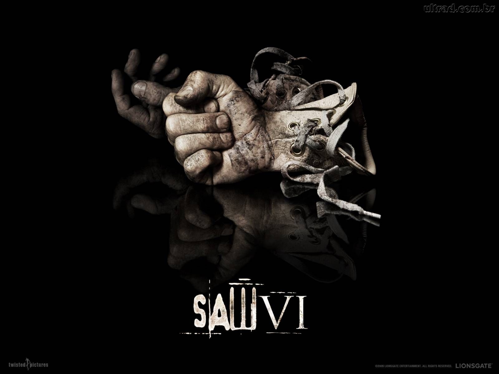


Teaser Trailer 4- Saw 3D
SAW 3D TEASER TRAILER:
- Production company
- Voice over
- Scary, Traumatising sound effects
- Very dramatic music
- Tag lines
- Camera shots, they are shown for a short amount of time
- Format of the film
- Release date
- Website
Friday, 19 February 2016
Teaser Trailer 3- The Imitation Game
THE IMITATION GAME TEASER TRAILER-
- Reviews
- Voiceover
- Tagline
- Name of film
- Rating
- Release date
- Reference to actors
- Website
- Social media links
- Camera shots
- Dialogue from the characters in the film
Teaser Trailer Conventions 2- X-Men: Apocalypse
X-MEN: APOCALYPSE TEASER TRAILER
- Production company
- Dramatic music
- Sound effects
- Range of different camera shots
- Short images of the main characters
- Voice over from the characters lines in the movie
- Tagline
- Release date- Memorial day, meaning it has some relevance to a significant time in the year
- Social media link
- Format of the film
Teaser Trailer Conventions 1- 50 Shades of Grey
50 SHADES OF GREY TEASER TRAILER:
- Name of the film
- Dramatic music and sound effects for example the fast breaths at the beginning
- Tense camera shots- lots of close-ups that fade quickly
- Editing styles
- Release date- this is a romance film and the release date is valentines day
- Reference to reviews
- Tag lines
- Voiceover
Teaser Trailer Conventions
These are what I found the conventions of teaser trailers were after i had watched them:
- Images/scenes from the film
- film title
- The website
- social media links
- Reference to other films
- Film title
- Release dates (this could be coming soon or a specific dates)
- Tagline
- Sound effects
- Narrator/ voice over
- Names of actors
- Music that shows the genre
- Speech from characters in the film
- Reviews
- Ratings
Analysis of trailer 2- Ted 2
Ted 2 trailers

Teaser trailer:
- Ted 2 is a comedy. We see in the teaser trailer a funny scene from the film, this allows the audience to see the comical side to the film, we do not need to be left in as much suspense as it is a comedy, the audience want to laugh through out the film.
- This teaser trailer is good as we get a small indication into the story line, we see that the film will be funny there fore making the audience want to see the film at the cinema
Theatrical trailer:
- We immediately see more of the storyline, there is also a narrator telling the story to the audience, by watching this we do see the most important parts to the film by i think that for comedies this has to be shown so that the audience will want to see the rest.
- We are also shown all the well-known celerities that star in the movie
Analysis of Trailers 1- The Terminator Genisys
The Terminator- Genisys

Teaser Trailer:
Theatrical Trailer:
- The theatrical trailer is released when the producers have edited the majority of the film and it is about to hit the cinema. We have theatrical trailers in order to tell the audience more of the story line. It is a 2 and half minute clip as a pose to the teaser trailer which is 30 seconds. A successful theatrical trailer will tell a small part to the story enough for the audience to sort of gauge what is going on but not too much that they can figure out the whole story
- As soon as we see the theatrical trailer immediately we are shown different characters and a whole other setting to the film.
- We also get an indication into the Sci-fy aspect of the film, where the characters are in space, when we see the teaser trailer, there is no indication that the film is set in space.
Comparing Teaser Trailers and Theatrical Trailers Introduction
In this section of my blog I will be looking at teaser trailers compared to theatrical trailers. I will do this to see the difference between the two. It will also allow me to analyse the trailer in terms of content and structure, by doing this I will be able to see what needs to go into my own trailer to make it look real.
The trailers i will be looking at are:
The Terminator- Genisys

The trailers i will be looking at are:
The Terminator- Genisys
Questionnaire for my Horror Magazine Front Cover
I need to find out some more information into the horror magazine genre. I will do this by creating a questionnaire on what the readers expectations are into what they would want to find on the front cover. I will be asking questions on what he design should be, the layout of the cover, what they would want to find in the magazine and what would draw them in.
The Questionnaire:
1. What is more likely to make you open the magazine to read it?
a) A special limited edition poster
b) An exclusive interview with a celebrity involved in the horror genre
c) Back stage images from a new horror film
2. What colours would attract you more to a horror magazine?
a) Black, white and grey- a dark front cover with no colour
b) Gory effects with lots of red (blood) and green (gross colours)
c) Silver and blue- more of a spooky, chilling theme
3. What font would suit the horror masthead?
a) Bold and chunky lettering
b) Spooky and ghostly font
c) Spiky and sharp lettering
4. What should the cover lines indicate?
a) Other horror films
b) Producers
c) Directors
d) Actors
e) Special effects
5. Would you rather....
a) Have more images
b) Have more text
6. What would you expect to see on the front cover
a) Scary character from a film
b) Director
c) Scary image
Magazine Cover Progression
The following images shows the process of my magazine front cover coming together


For my magazine cover I took images of one of the actors who starred in my trailer, I applied scary gory make up to make it look as terrifying as possible. In my magazine cover i tried to replicate Fangoria magazine and the style it uses to create a truly horrifying atmosphere for the magazine cover. By using photo shop i was able to crop around the image of the character in order to drop it onto a back ground. I chose to colour scheme to make it as eye catching as possible. The font I used it called ghoulish, it represents the horror genre well. I added cover lines, issue number, a banner, masthead, main cover lines and barcodes in order to make the magazine cover look as authentic as possible.
Thursday, 18 February 2016
Possible Layouts for the Magazine
Before making my magazine cover I am going to sketch some layout ideas, this will enable me to see if my magazine cover looks authentic. It will make it easier to construct the poster if i do some sketched first. I have not yet put detail in as it is a rough idea of what the cover may look like.

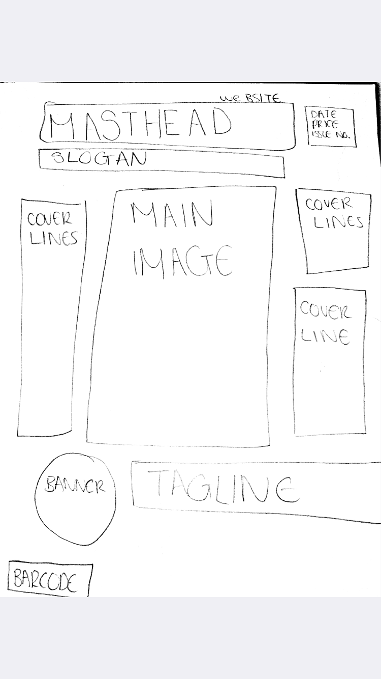

In these sketches i continued to add some more detail, like the name of the magazine and some of the cover lines that i will be using.


Wednesday, 17 February 2016
Possible Images for my Magazine
My magazine replicates an old school retro horror magazine. If i had to compare it to another magazine it would be in the same league as Fangoria Magazine. The image I am going to put on the front will be scary, it suits the horror genre.


The final image is the one that i am going to use, it is the best quality and the facial expression is more realistic.
Potential Magazine Font
Using FontYukle, i will be looking at different fonts to use for my magazine name. I would like to find one that is simple but at the same time gets the feeling of horror across to the audience.


- This font is called Ghoulish, it is bold and stands out

- It is called Pahuenga, I like this one because it is different to other magazines, and it is also interesting to look it

- This font is quite similar to the second font that i used, it is called Lugosi

- Although this font looks good, it may be quite hard for some people to read. I do not want the name of my magazine to get confused in the eyed of the audience
- This font is called Qranklestein

- I chose this as one of my potential fonts as it is easy to read and looks like a magazine font that would be used
- It is called Karloff

- The name of this is called Vademecum
- Although it looks aesthetically pleasing it does not necessarily portray the horror genre that i am going for
The type of font i have decided to use it FONT 1, this is because it is simple, easy to read and it is build. Most of all it fits the horror genre very well and i feel the audience could tell this straight away from looking at it.
What Will Appear on my Magazine Cover
I have decided the name of my magazine will be- Fright International
The main cover line - Exclusive images from new horror film..... 'The Disturbed'
Issue Number- 118
Date- September 2015
Slogan- The only magazine that talks blood, gore and more
More cover lines-
- The Conjuring VS Insidious
- Chainsaw Massacre- The body count continues
- Annabelle and Chucky..... secret romance?
- Untold script secrets of The Shining
- James Wan hints on directing
- Freddy Kreuger talks Friday the 13th sequence 2
I looked at many different magazine front covers and from this i could tell that Horror magazine covers contain lots of short, catchy sentences. They also talk a lot about older horror films compared to news ones, this is something that i have tried to incorporate into my magazine cover. I did the date in september, this is because my horror film Grandma's house is being released on halloween. This is a good date for a film release as older teenagers and adults with no children go to the cinema on this date.
Tuesday, 16 February 2016
Potential Names for my Magazine
I have come to a decision that my magazine is going to be like Fangoria magazine, specialising in independent horror movies. This means I will be able to focus on only one genre of film, this being horror.
Names for the magazine:
1) SCREAM MAGAZINE-
3) FRIGHT INTERNATIONAL-
6) MASSACRE MAGAZINE-
Names for the magazine:
1) SCREAM MAGAZINE-
- The name of this magazine is good because the word scream gets the point of it being a horror magazine across to the audience
- The negative points about this magazine is that the word SCREAM is not very original and there are other magazines with similar names
- This magazine name works in some ways but it others it may get interpreted wrong by the audience. This is because 'Bones' could also imply thriller or a crime magazine
- It is good as a name as it is short, catchy and easy to remember
3) FRIGHT INTERNATIONAL-
- As a magazine title this sounds authentic but at the same time it may be too long for the audience.
- It is not as catchy as many other names i have come up with
- I personally like this because I feel the word GORE really captures to feeling of the magazine, gore is a good word when it comes to horror because it applies in many ways
- At the same time i think that there are better names i can come up with
- This film name has a really mysterious feel to it which can be good but it also may take away the feeling of horror
- The design of the magazine to suit this name could be really interesting and the theme of the 'dark moon' could be carries the whole way through the magazine
6) MASSACRE MAGAZINE-
- This is one of my favourite names, the horror that comes with 'Massacres' in general is something I can really play around with throughout the magazine
- This name implies horror, blood and gore, which is perfect when speaking about the horror genre
- The only problem with this name is that it resembles 'Empire' magazine which is for mainstream hollywood blockbusters. If i was to use this name I would have to emphasise the word 'EVIL' and not so much empire.
- Apart from that this name is good as it incorporates all forms if horror. The word evil can be supernatural horror and just horror in general
Monday, 15 February 2016
Certificate for my Film Research- BBFC
From my knowledge of films I would think that my film would be a 15 or 18 certificate. This is because of the psychological horror that will be shown in the film. but from looking at research and information done by the BBFC I will be able to see the guidelines of what actually makes a film a certain certificate.
The certificate tells the audience how appropriate the film is for certain age groups. These certificated go from:


The certificate tells the audience how appropriate the film is for certain age groups. These certificated go from:

- The U symbol means Universal. These films are suitable for all audiences ages 4 and over. Know one will ever know what will upset children at this young of an age, but what is shown in the film is seen as acceptable for young children to see.
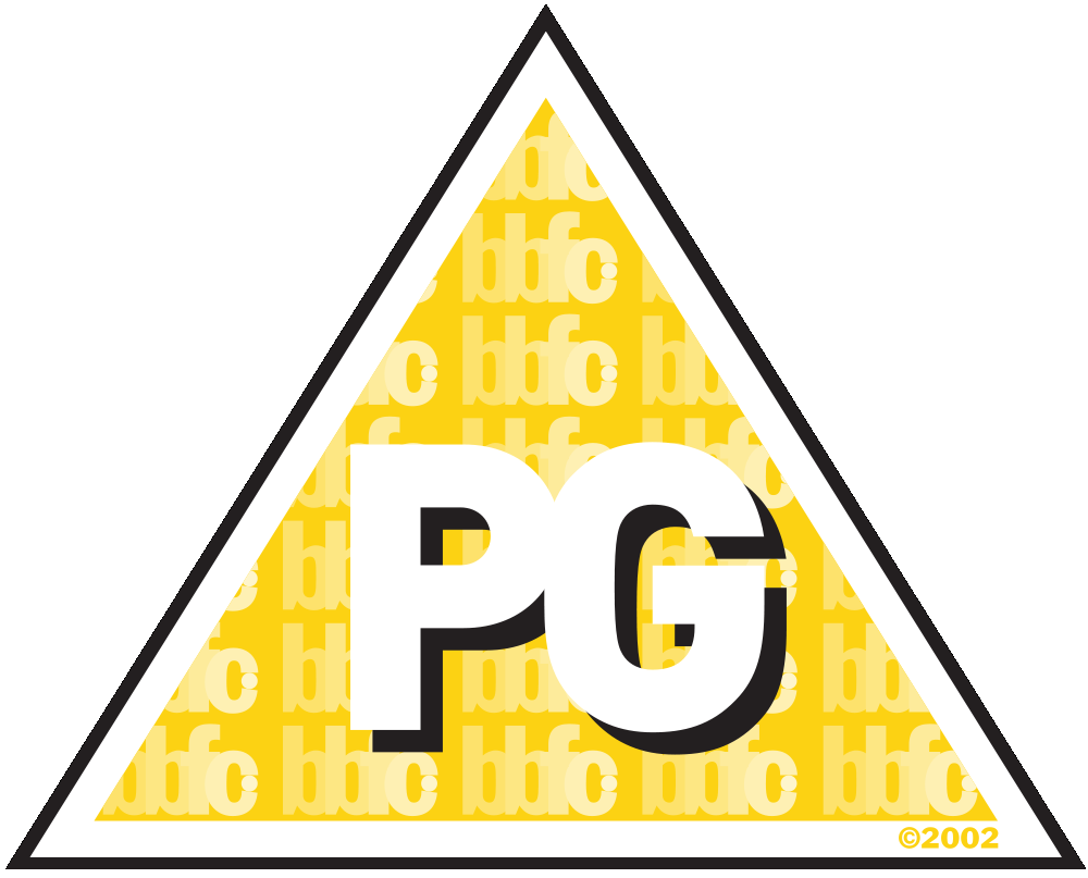
- PG stands for Parental Guidance, it is suitable for general viewing.
- some scenes may not be suitable for very young children, it is up to the parents to decide whether the film is suitable for the children seeing it .
- PG are not just for children many adults enjoy watching them too

- This certificate is more for the DVD/Blu-ray
- It is there so that the customer can only be sold a film with this certificate if they are over the age of 12

- 12A certificates are not suitable for children under the age of 12
- The cinema could lose its license if the accompaniment of an adult is not enforced

- No one under the age of 15 is allowed to see the film and the cinema or rent/buy the video
- strong violence
- frequent or strong language
- drug taking
- discriminatory language or behaviour
- brief scenes of sexual violence or verbal references to sexual violence
- portrayals of sexual activity
- sexual nudity

- The films rated 18 are specifically for adults
- 18 are definitely not suitable for children, no themes are prohibited in an 18
- adults are free to chose their own entertainment as long as it is not illegal or harmful.
This is what can be contained in 18 films:
- very strong violence
- real sex (in some cases)
- discriminatory language and behaviour
- strong horror
- strong blood and gore
- strong horror
- scenes of sexual violence
- strong portrayals of sexual activity
- frequent strong/very language
Seeing as my film would categorise as being a 15, i am going to do some more research into what aspects there are into these certificates.
15 films-
Violence:
In a 15 film the violence may be realistic but not unjustified or focuses on blood injury. Strong gory images will only be allowed if explained by the content shown. There is a specific way in which sexual violence is portrayed. Any such content must be clearly justified. In horror the category will be psychological in nature. Acts of sadism which is common in the horror genre are not allowed.
Sexual Nudity/Content:
Strong sex references may be acceptable at a 15, scenes of a sexual nature are also allowed but they must not be explicit or prolonged
Language:
Strong language is allowed. Frequent or aggressive use of the words must be explained within the context of the film
Drugs:
Scenes or dialogue relating to drugs are acceptable in a suitable context, it is NOT allowed to be shown if there is an instruction or encouragement into the use of drugs. Drugs are also not allowed to be shown if they are seen in the film to be glamorous or trendy.
Subscribe to:
Comments (Atom)